Plotting#
For any dataset larger than a few points, visual representations are just about the only way to convey the detailed properties of the data. There are many ways to make visualizations in Python, but one of the most common for pandas.DataFrame users is the Pandas .plot() API. These plotting commands use Matplotlib to render static PNGs or SVGs in a Jupyter notebook using the inline backend, or interactive figures via %matplotlib widget, with a command that can be as simple as df.plot() for a DataFrame with one or two columns.
The Pandas .plot() API has emerged as a de-facto standard for high-level plotting APIs in Python, and is now supported by many different libraries that use various underlying plotting engines to provide additional power and flexibility. Learning this API allows you to access capabilities provided by a wide variety of underlying tools, with relatively little additional effort. The libraries currently supporting this API include:
Pandas – Matplotlib-based API included with Pandas. Static or interactive output in Jupyter notebooks.
xarray – Matplotlib-based API included with XArray, based on pandas .plot API. Static or interactive output in Jupyter notebooks.
hvPlot – Bokeh/Matplotlib/Plotly-based HoloViews plots for Pandas, GeoPandas, xarray, Dask, Intake, and Streamz data.
Pandas Bokeh – Bokeh-based interactive plots, for Pandas, GeoPandas, and PySpark data.
Cufflinks – Plotly-based interactive plots for Pandas data.
Plotly Express – Plotly-Express-based interactive plots for Pandas data; only partial support for the .plot API keywords.
PdVega – Vega-lite-based, JSON-encoded interactive plots for Pandas data.
In this notebook we’ll explore what is possible with the default .plot API and demonstrate the additional capabilities provided by .hvplot, which include seamless interactivity in notebooks and deployed dashboards, server-side rendering of even the largest datasets, automatic small multiples and widget selectors for exploring complex data, and easy composition and linking of plots after they are generated.
To show these features, we’ll use a tabular dataset of earthquakes and other seismological events queried from the USGS Earthquake Catalog using its API. Of course, this particular dataset is just an example; the same approach can be used with just about any tabular dataset, and similar approaches can be used with gridded (multidimensional array) datasets or other types of data.
Read in the data#
Here we will focus on Pandas, but a similar approach will work for any supported DataFrame type, including Dask for distributed computing or RAPIDS cuDF for GPU computing. This medium-sized dataset has 2.1 million rows, which should fit into memory on any recent machine without needing special out-of-core or distributed approaches like Dask provides.
import pathlib
import pandas as pd
%%time
df = pd.read_parquet(pathlib.Path('../data/earthquakes-projected.parq'))
CPU times: user 2.22 s, sys: 243 ms, total: 2.47 s
Wall time: 1.42 s
print(df.shape)
df.head()
(2116537, 23)
| depth | depthError | dmin | gap | horizontalError | id | latitude | locationSource | longitude | mag | ... | magType | net | nst | place | rms | status | type | updated | easting | northing | |
|---|---|---|---|---|---|---|---|---|---|---|---|---|---|---|---|---|---|---|---|---|---|
| time | |||||||||||||||||||||
| 2000-01-31 23:52:00.619000+00:00 | 7.800 | 1.400 | 0.09500 | 245.14 | NaN | nn00001936 | 37.1623 | nn | -116.6037 | 0.60 | ... | ml | nn | 5.0 | Nevada | 0.0519 | reviewed | earthquake | 2018-04-24T22:22:44.135Z | -1.298026e+07 | 4.461754e+06 |
| 2000-01-31 23:44:54.060000+00:00 | 4.516 | 0.479 | 0.05131 | 52.50 | NaN | ci9137218 | 34.3610 | ci | -116.1440 | 1.72 | ... | mc | ci | 0.0 | 26km NNW of Twentynine Palms, California | 0.1300 | reviewed | earthquake | 2016-02-17T11:53:52.643Z | -1.292909e+07 | 4.077379e+06 |
| 2000-01-31 23:28:38.420000+00:00 | 33.000 | NaN | NaN | NaN | NaN | usp0009mwt | 10.6930 | trn | -61.1620 | 2.10 | ... | md | us | NaN | Trinidad, Trinidad and Tobago | NaN | reviewed | earthquake | 2014-11-07T01:09:23.016Z | -6.808523e+06 | 1.197310e+06 |
| 2000-01-31 23:05:22.010000+00:00 | 33.000 | NaN | NaN | NaN | NaN | usp0009mws | -1.2030 | us | -80.7160 | 4.50 | ... | mb | us | NaN | near the coast of Ecuador | 0.6000 | reviewed | earthquake | 2014-11-07T01:09:23.014Z | -8.985264e+06 | -1.339272e+05 |
| 2000-01-31 22:56:50.996000+00:00 | 7.200 | 0.900 | 0.11100 | 202.61 | NaN | nn00001935 | 38.7860 | nn | -119.6409 | 1.40 | ... | ml | nn | 5.0 | Nevada | 0.0715 | reviewed | earthquake | 2018-04-24T22:22:44.054Z | -1.331836e+07 | 4.691064e+06 |
5 rows × 23 columns
To compare HoloViz approaches with other approaches, we’ll also construct a subsample of the dataset that’s tractable with any plotting or analysis tool, but has only 1% of the data:
small_df = df.sample(frac=.01)
print(small_df.shape)
small_df.head()
(21165, 23)
| depth | depthError | dmin | gap | horizontalError | id | latitude | locationSource | longitude | mag | ... | magType | net | nst | place | rms | status | type | updated | easting | northing | |
|---|---|---|---|---|---|---|---|---|---|---|---|---|---|---|---|---|---|---|---|---|---|
| time | |||||||||||||||||||||
| 2007-09-27 04:54:25.640000+00:00 | 2.658 | 0.26 | 0.005405 | 28.0 | 0.15 | nc40202712 | 38.7935 | nc | -122.801667 | 1.90 | ... | md | nc | 48.0 | Northern California | 0.06 | reviewed | earthquake | 2017-01-17T00:21:50.120Z | -1.367022e+07 | 4.692135e+06 |
| 2015-05-22 03:36:30.299000+00:00 | 99.300 | 0.50 | NaN | NaN | NaN | ak0156iwbd1x | 60.3533 | ak | -152.442600 | 1.50 | ... | ml | ak | NaN | 22km SE of Redoubt Volcano, Alaska | 0.50 | reviewed | earthquake | 2019-05-21T04:03:38.589Z | -1.696983e+07 | 8.478820e+06 |
| 2016-01-18 18:02:26+00:00 | 40.800 | 10.10 | NaN | NaN | 5.20 | us10004fy2 | 54.0744 | ak | -163.199700 | 2.50 | ... | ml | us | NaN | 87km S of False Pass, Alaska | 0.75 | reviewed | earthquake | 2019-05-21T06:21:32.063Z | -1.816731e+07 | 7.184259e+06 |
| 2009-11-02 04:53:32.742000+00:00 | 67.400 | 1178.20 | NaN | NaN | NaN | ak009e255d0a | 51.8971 | ak | -174.543000 | 2.40 | ... | ml | ak | NaN | Andreanof Islands, Aleutian Islands, Alaska | 0.43 | reviewed | earthquake | 2019-02-13T12:59:31.884Z | -1.943004e+07 | 6.781541e+06 |
| 2014-05-26 23:51:49.140000+00:00 | 23.725 | 31.61 | 2.402000 | 335.0 | 43.93 | uw60784837 | 44.1340 | uw | -126.763500 | 2.58 | ... | md | uw | 16.0 | off the coast of Oregon | 1.77 | reviewed | earthquake | 2016-07-22T19:29:19.040Z | -1.411125e+07 | 5.486202e+06 |
5 rows × 23 columns
We’ll switch back and forth between small_df and df depending on whether the technique we are showing works well only for small datasets, or whether it can be used for any dataset.
Using Pandas .plot()#
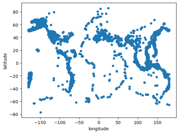
The first thing that we’d like to do with this data is visualize the locations of every earthquake. So we would like to make a scatter or points plot where x is longitude and y is latitude.
We can do that for the smaller dataframe using the pandas.plot API and Matplotlib:
%matplotlib inline
small_df.plot.scatter(x='longitude', y='latitude');
Exercise:#
Try changing inline to widget and see what interactivity is available from Matplotlib. In some cases you may have to reload the page and restart this notebook to get it to display properly.
Using .hvplot#
As you can see above, the Pandas API gives you a usable plot very easily, where you can start to see the structure of the edges of the tectonic plates, which in many cases correspond with visible geographic features of continents (e.g. the westward side of North and South America, on the left, and the center of the Atlantic Ocean, in the center). You can make a very similar plot with the same arguments using hvplot, after importing hvplot.pandas to install hvPlot support into Pandas:
import hvplot.pandas # noqa: adds hvplot method to pandas objects
small_df.hvplot.scatter(x='longitude', y='latitude')
Here unlike in the Pandas .plot() the displayed plot is a Bokeh plot that has a default hover action on the datapoints to show the location values, and you can always pan and zoom to focus on any particular region of the data of interest. Zoom and pan also work if you use the widget Matplotlib backend.
You might have noticed that many of the dots in the scatter that we’ve just created lie on top of one another. This is called “overplotting” and can be avoided in a variety of ways, such as by making the dots slightly transparent, or binning the data.
Exercise#
Try changing the alpha (try .1) on the plot above to see the effect of this approach
small_df.hvplot.scatter(x='longitude', y='latitude', alpha=0.1)
Try creating a hexbin plot.
small_df.hvplot.hexbin(x='longitude', y='latitude')
Getting help with hvplot options#
You may be wondering how you could have found out about the alpha keyword option in the first exercise or how you can learn about all the options that are available with hvplot. For this purpose, you can use tab-completion in the Jupyter notebook or the hvplot.help function which are documented in the user guide.
For tab completion, you can press tab after the opening parenthesis in a obj.hvplot.<kind>( call. For instance, you can try pressing tab after the partial expression small_df.hvplot.scatter(<TAB>.
Alternatively, you can call hvplot.help(<kind>) to see a documentation pane pop up in the notebook. Try uncommenting the following line and executing it:
# hvplot.help('scatter')
You will see there are a lot of options! You can control which section of the documentation you view with the generic, docstring and style boolean switches also documented in the user guide. If you run the following cell, you will see that alpha is listed in the ‘Style options’.
# hvplot.help('scatter', style=True, generic=False)
These style options refer to options that are part of the Bokeh API. This means that the alpha keyword is passed directly to Bokeh just like all the other style options. As these are Bokeh-level options, you can find out more by using the search functionality in the Bokeh docs.
Datashader#
As you saw above, there are often arbitrary choices that you are faced with making even before you understand the properties of the dataset, such as selecting an alpha value or a bin size for aggregations. Making such assumptions can accidentally bias you towards certain aspects of the data, and of course having to throw away 99% of the data can cover up patterns you might have otherwise seen. For an initial exploration of a new dataset, it’s much safer if you can just see the data, before you impose any assumptions about its form or structure, and without having to subsample it.
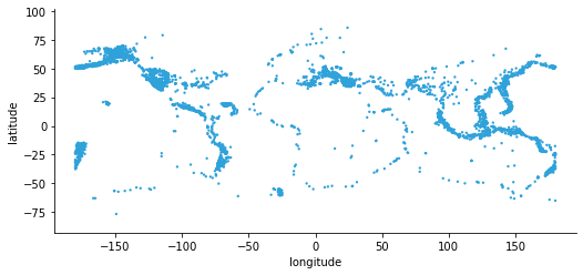
To avoid some of the problems of traditional scatter/point plots we can use hvPlot’s Datashader support. Datashader aggregates data into each pixel without any arbitrary parameter settings, making your data visible immediately, before you know what to expect of it. In hvplot we can activate this capability by setting rasterize=True to invoke Datashader before rendering and cnorm='eq_hist' (“histogram equalization”) to specify that the colormapping should adapt to whatever distribution the data has:
small_df.hvplot.scatter(x='longitude', y='latitude', rasterize=True, cnorm='eq_hist')
We can already see a lot more detail, but remember that we are still only plotting 1% of the data (21k earthquakes). With Datashader, we can quickly and easily plot all of the full, original dataset of 2.1 million earthquakes:
df.hvplot.scatter(x='longitude', y='latitude', rasterize=True, cnorm='eq_hist', dynspread=True)
Here you can see all of the rich detail in the full set of millions of earthquake event locations. If you have a live Python process running, you can zoom in and see additional detail at each zoom level, without tuning any parameters or making any assumptions about the form or structure of the data. If you prefer, you can specify colormapping cnorm='log' or the default cnorm='linear', which are easier to interpret, but starting with cnorm='eq_hist' is usually a good idea so that you can see the shape of the data before committing to an easier-to-interpret but potentially data-obscuring colormap. You can learn more about Datashader on datashader.org or the Datashader page on holoviews.org. For now, the most important thing to know about it is that Datashader lets us work with arbitrarily large datasets in a web browser conveniently.
Here we used .hvplot() on a Pandas dataframe, but (unlike other .plot libraries), the same commands will work on many other libraries after the appropriate import (import hvplot.xarray, import hvplot.dask, etc.):
Pandas : DataFrame, Series (columnar/tabular data)
xarray : Dataset, DataArray (labelled multidimensional arrays)
Dask : DataFrame, Series (distributed/out of core arrays and columnar data)
Streamz : DataFrame(s), Series(s) (streaming columnar data)
Intake : DataSource (data catalogues)
GeoPandas : GeoDataFrame (geometry data)
NetworkX : Graph (network graphs)
Exercise#
Select a subset of the data, e.g. only magitudes >5 and plot them with a different colormap (valid cmap values include ‘viridis_r’, ‘Reds’, and ‘magma_r’):
df[df.mag>5].hvplot.scatter(x='longitude', y='latitude', rasterize=True, cnorm='eq_hist', cmap='Reds')
Statistical Plots#
Let’s dive into some of the other capabilities of .plot() and .hvplot(), starting with the frequency of different magnitude earthquakes.
Magnitude |
Earthquake Effect |
Estimated Number Each Year |
|---|---|---|
2.5 or less |
Usually not felt, but can be recorded by seismograph. |
900,000 |
2.5 to 5.4 |
Often felt, but only causes minor damage. |
30,000 |
5.5 to 6.0 |
Slight damage to buildings and other structures. |
500 |
6.1 to 6.9 |
May cause a lot of damage in very populated areas. |
100 |
7.0 to 7.9 |
Major earthquake. Serious damage. |
20 |
8.0 or greater |
Great earthquake. Can totally destroy communities near the epicenter. |
One every 5 to 10 years |
As a first pass, we’ll use a histogram first with .plot.hist, then with .hvplot.hist. Before plotting we can clean the data by setting any magnitudes that are less than 0 to NaN.
cleaned_df = df.copy()
cleaned_df['mag'] = df.mag.where(df.mag > 0)
cleaned_df.plot.hist(y='mag', bins=50);
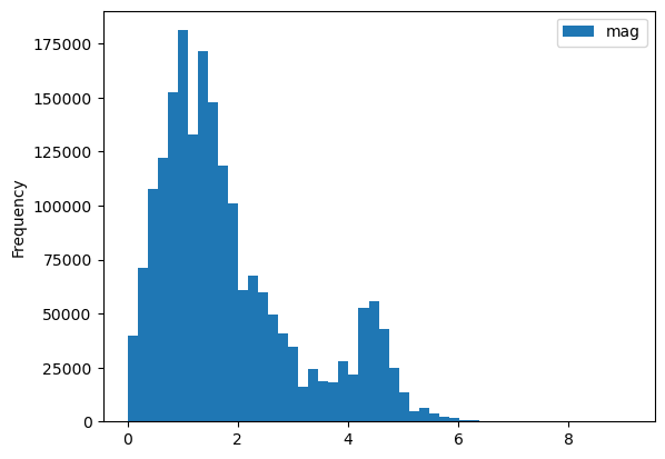
df.hvplot.hist(y='mag', bin_range=(0, 10), bins=50)
Exercise#
Create a kernel density estimate (kde) plot of magnitude for cleaned_df:
cleaned_df.hvplot.kde(y='mag')
Categorical variables#
Next we’ll categorize the earthquakes based on depth. You can read about all the different variables available in this dataset here. According to the USGS page on earthquake depths, typical depth categories are:
Depth class |
Depth |
|---|---|
shallow |
0 - 70 km |
intermediate |
70 - 300 km |
deep |
300 - 700 km |
First we’ll use pd.cut to split the small_dataset into depth categories.
import numpy as np
import pandas as pd
depth_bins = [-np.inf, 70, 300, np.inf]
depth_names = ['Shallow', 'Intermediate', 'Deep']
depth_class_column = pd.cut(cleaned_df['depth'], depth_bins, labels=depth_names)
cleaned_df.insert(1, 'depth_class', depth_class_column)
We can now use this new categorical variable to group our data. First we will overlay all our groups on the same plot using the by option:
cleaned_df.hvplot.hist(y='mag', by='depth_class', alpha=0.6)
NOTE: Click on the legend to turn off certain categories and see what is behind them.
Exercise#
Add subplots=True and width=300 to see the different classes side-by-side instead of overlaid. The axes will be linked, so try zooming.
Grouping#
What if you want a single plot, but want to see each class separately? You can use the groupby option to get a widget for toggling between classes, here in a bivariate plot (using a subset of the data as bivariate plots can be expensive to compute):
cleaned_small_df = cleaned_df.sample(frac=.01)
cleaned_small_df.hvplot.bivariate(x='mag', y='depth', groupby='depth_class')
In addition to classifying by depth, we can classify by magnitude.
Magnitude Class |
Magnitude |
|---|---|
Great |
8 or more |
Major |
7 - 7.9 |
Strong |
6 - 6.9 |
Moderate |
5 - 5.9 |
Light |
4 - 4.9 |
Minor |
3 -3.9 |
classified_df = df[df.mag >= 3].copy()
depth_class = pd.cut(classified_df.depth, depth_bins, labels=depth_names)
classified_df['depth_class'] = depth_class
mag_bins = [2.9, 3.9, 4.9, 5.9, 6.9, 7.9, 10]
mag_names = ['Minor', 'Light', 'Moderate', 'Strong', 'Major', 'Great']
mag_class = pd.cut(classified_df.mag, mag_bins, labels=mag_names)
classified_df['mag_class'] = mag_class
categorical_df = classified_df.groupby(['mag_class', 'depth_class'], observed=True).count().reset_index()
Now that we have binned the data into two categories, we can use a logarithmic heatmap to visually represent this data as the count of detected earthquake events in each combination of depth and mag class:
categorical_df.hvplot.heatmap(x='mag_class', y='depth_class', C='id',
logz=True, clim=(1, np.nan)).aggregate(function=np.mean)
Here it is clear that the most commonly detected events are light, and typically shallow.
Output Matplotlib or Plotly plots#
While the default plotting backend/extension of hvPlot is Bokeh, it also supports rendering plots with either Plotly or Matplotlib. Plotly is an interactive library that provides data-exploring actions (pan, hover, zoom, etc.) that are similar to Bokeh. You can decide to use Plotly instead of Bokeh if you prefer its look and feel, need interactive 3D plots, or if your organization’s policy is to use that plotting library. Matplotlib is supported for static plots only (e.g. PNG or SVG), which is useful for saving and sharing images and embedding them in documents for publication.
To load a plotting backend you can use the hvplot.extension function. The first backend you declare in the call to the function will be set as the default one.
hvplot.extension('plotly', 'matplotlib')
small_df.hvplot.scatter(x='longitude', y='latitude')
Once a backend is loaded with hvplot.extension you can use the hvplot.output function to switch from one backend to another.
hvplot.output(backend='matplotlib')
plot = small_df.hvplot.scatter(x='longitude', y='latitude')
plot

Save and further customize plots#
You can easily save a plot with the hvplot.save function in one of the output formats supported by the backend. This is particularly useful when you are using Matplotlib as your plotting backend, so that you can create static plots suited for reports or publications.
fp_png, fp_svg = '../output/plot.png', '../output/plot.svg'
hvplot.save(plot, fp_png)
hvplot.save(plot, fp_svg)
from IPython.display import display, Image, SVG
display(Image(fp_png))
display(SVG(fp_svg))

While hvPlot allows you to customize your plots quite extensively there are always situations where you want to customize them a little more than what can be done directly with hvPlot. In those cases you can use the hvplot.render function to get a handle on the underlying figure object. Below we’re using Matplotlib’s xkcd context manager to turn on xkcd sketch-style drawing mode while rendering the figure.
import matplotlib.pyplot as plt
with plt.xkcd():
mpl_fig = hvplot.render(plot)
mpl_fig
findfont: Font family 'xkcd' not found.
findfont: Font family 'Comic Sans MS' not found.
findfont: Font family 'xkcd' not found.
findfont: Font family 'Comic Sans MS' not found.
findfont: Font family 'xkcd' not found.
findfont: Font family 'Comic Sans MS' not found.
findfont: Font family 'xkcd' not found.
findfont: Font family 'Comic Sans MS' not found.
findfont: Font family 'xkcd' not found.
findfont: Font family 'Comic Sans MS' not found.
findfont: Font family 'xkcd' not found.
findfont: Font family 'Comic Sans MS' not found.
findfont: Font family 'xkcd' not found.
findfont: Font family 'Comic Sans MS' not found.
findfont: Font family 'xkcd' not found.
findfont: Font family 'Comic Sans MS' not found.
findfont: Font family 'xkcd' not found.
findfont: Font family 'Comic Sans MS' not found.
findfont: Font family 'xkcd' not found.
findfont: Font family 'Comic Sans MS' not found.
findfont: Font family 'xkcd' not found.
findfont: Font family 'Comic Sans MS' not found.
findfont: Font family 'xkcd' not found.
findfont: Font family 'Comic Sans MS' not found.
findfont: Font family 'xkcd' not found.
findfont: Font family 'Comic Sans MS' not found.
findfont: Font family 'xkcd' not found.
findfont: Font family 'Comic Sans MS' not found.
findfont: Font family 'xkcd' not found.
findfont: Font family 'Comic Sans MS' not found.
findfont: Font family 'xkcd' not found.
findfont: Font family 'Comic Sans MS' not found.
findfont: Font family 'xkcd' not found.
findfont: Font family 'Comic Sans MS' not found.
findfont: Font family 'xkcd' not found.
findfont: Font family 'Comic Sans MS' not found.
findfont: Font family 'xkcd' not found.
findfont: Font family 'Comic Sans MS' not found.
findfont: Font family 'xkcd' not found.
findfont: Font family 'Comic Sans MS' not found.
findfont: Font family 'xkcd' not found.
findfont: Font family 'Comic Sans MS' not found.
findfont: Font family 'xkcd' not found.
findfont: Font family 'Comic Sans MS' not found.
findfont: Font family 'xkcd' not found.
findfont: Font family 'Comic Sans MS' not found.
findfont: Font family 'xkcd' not found.
findfont: Font family 'Comic Sans MS' not found.
findfont: Font family 'xkcd' not found.
findfont: Font family 'Comic Sans MS' not found.
findfont: Font family 'xkcd' not found.
findfont: Font family 'Comic Sans MS' not found.
findfont: Font family 'xkcd' not found.
findfont: Font family 'Comic Sans MS' not found.
findfont: Font family 'xkcd' not found.
findfont: Font family 'Comic Sans MS' not found.
findfont: Font family 'xkcd' not found.
findfont: Font family 'Comic Sans MS' not found.
findfont: Font family 'xkcd' not found.
findfont: Font family 'Comic Sans MS' not found.
findfont: Font family 'xkcd' not found.
findfont: Font family 'Comic Sans MS' not found.
findfont: Font family 'xkcd' not found.
findfont: Font family 'Comic Sans MS' not found.
findfont: Font family 'xkcd' not found.
findfont: Font family 'Comic Sans MS' not found.
findfont: Font family 'xkcd' not found.
findfont: Font family 'Comic Sans MS' not found.
findfont: Font family 'xkcd' not found.
findfont: Font family 'Comic Sans MS' not found.
findfont: Font family 'xkcd' not found.
findfont: Font family 'Comic Sans MS' not found.
findfont: Font family 'xkcd' not found.
findfont: Font family 'Comic Sans MS' not found.
findfont: Font family 'xkcd' not found.
findfont: Font family 'Comic Sans MS' not found.
findfont: Font family 'xkcd' not found.
findfont: Font family 'Comic Sans MS' not found.
findfont: Font family 'xkcd' not found.
findfont: Font family 'Comic Sans MS' not found.
findfont: Font family 'xkcd' not found.
findfont: Font family 'Comic Sans MS' not found.
findfont: Font family 'xkcd' not found.
findfont: Font family 'Comic Sans MS' not found.
findfont: Font family 'xkcd' not found.
findfont: Font family 'Comic Sans MS' not found.
findfont: Font family 'xkcd' not found.
findfont: Font family 'Comic Sans MS' not found.
findfont: Font family 'xkcd' not found.
findfont: Font family 'Comic Sans MS' not found.
findfont: Font family 'xkcd' not found.
findfont: Font family 'Comic Sans MS' not found.
findfont: Font family 'xkcd' not found.
findfont: Font family 'Comic Sans MS' not found.
findfont: Font family 'xkcd' not found.
findfont: Font family 'Comic Sans MS' not found.
findfont: Font family 'xkcd' not found.
findfont: Font family 'Comic Sans MS' not found.
findfont: Font family 'xkcd' not found.
findfont: Font family 'Comic Sans MS' not found.
findfont: Font family 'xkcd' not found.
findfont: Font family 'Comic Sans MS' not found.
findfont: Font family 'xkcd' not found.
findfont: Font family 'Comic Sans MS' not found.
findfont: Font family 'xkcd' not found.
findfont: Font family 'Comic Sans MS' not found.
findfont: Font family 'xkcd' not found.
findfont: Font family 'Comic Sans MS' not found.
findfont: Font family 'xkcd' not found.
findfont: Font family 'Comic Sans MS' not found.
findfont: Font family 'xkcd' not found.
findfont: Font family 'Comic Sans MS' not found.
findfont: Font family 'xkcd' not found.
findfont: Font family 'Comic Sans MS' not found.
findfont: Font family 'xkcd' not found.
findfont: Font family 'Comic Sans MS' not found.
findfont: Font family 'xkcd' not found.
findfont: Font family 'Comic Sans MS' not found.
findfont: Font family 'xkcd' not found.
findfont: Font family 'Comic Sans MS' not found.
findfont: Font family 'xkcd' not found.
findfont: Font family 'Comic Sans MS' not found.
findfont: Font family 'xkcd' not found.
findfont: Font family 'Comic Sans MS' not found.
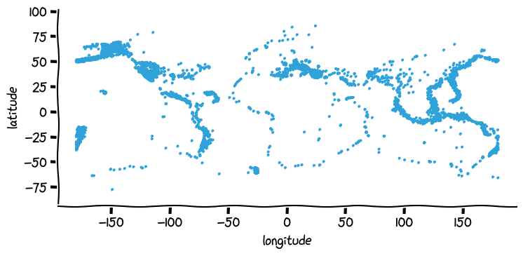
mpl_fig is a Matplotlib Figure object that we could further customize using Matplotlib’s API.
Since hvPlot is built on HoloViews, you can also use HoloViews opts and backend_opts and hooks to configure backend options before rendering.
Explore data#
.hvplot() is a simple and intuitive way to create plots. However when you are exploring data you don’t always know in advance the best way to display it, or even what kind of plot would be best to visualize the data. You will very likely embark in an iterative process that implies choosing a kind of plot, setting various options, running some code, and repeating until you’re satisfied with the output and the insights you get. hvPlot’s Explorer is a Graphical User Interface that allows you to easily generate customized plots, which in practice gives you the possibility to explore both your data and hvPlot’s extensive API.
To create an Explorer, you pass your data to the high-level hvplot.explorer function, which returns a Panel layout that can be displayed in a notebook or served in a web application. This object displays on the right-hand side a preview of the plot you are building, and on the left-hand side the various options that you can set to customize the plot.
hvplot.output(backend='bokeh') # Switch the plotting backend back to Bokeh for more interactivity
hvplot.explorer(small_df)
With the explorer set up you can now start exploring your data in a very interactive way, changing for instance the plot kind to scatter and x to longitude and y to latitude to reproduce a map, then select a variable to group by to get a widget to select for different values of that variable.
Once you have found a representation of the data that you want to capture, you can record the configuration in a few ways:
call
hvexplorer.settings()to obtain a configuration dictionary (let’s call itsettings) that you can then unpack tosmall_df.hvplot(**settings)to recreate the same exact plot you see in the explorercall
hvexplorer.plot_code('small_df')to print a string that you can copy and paste in another cell and that will again recreate the same exact plot you see in the explorer
Don’t feel bad (we don’t!) about deleting the explorer from your notebook when you’re done with it, it’s not meant to clutter your notebooks, it’s to enable you to even more easily explore data and collect insights.
Learn more#
As you can see, hvPlot makes it simple to explore your data interactively, with commands based on the widely used Pandas .plot() API but now supporting many more features and different types of data. The visualizations above just touch the surface of what is available from hvPlot, and you can explore the hvPlot website to see much more, or just explore it yourself using tab completion (df.hvplot.[TAB]). The following section will focus on how to put these plots together once you have them, linking them to understand and show their structure.
