Composing Plots#
At first glance, hvPlot behaves like any of the other libraries offering the .plot API, in that calling .hvPlot results in a plot in your notebook. But the actual output returned by .hvplot isn’t a plot at all; it’s a rich Python object that captures your data and your plotting options in a way that Jupyter renders as a plot if it turns out to be the value of a notebook cell. Specifically, the value returned from .hvplot is a HoloViews object, which is a rich, composable, and compositional object with lots of powerful capabilities that you can access before eventually plotting it.
In this notebook, we’ll examine the output of hvPlot calls to take a look at individual HoloViews objects. Then we will see how these HoloViews “elements” offer us powerful ways of combining and composing layered visualizations.
Read in the data#
We’ll read in the data as before, and also reindex by time so that we can more easily do resampling.
import pathlib
import pandas as pd
import numpy as np
%%time
df = pd.read_parquet(pathlib.Path('../data/earthquakes-projected.parq'))
CPU times: user 2.15 s, sys: 246 ms, total: 2.4 s
Wall time: 1.38 s
Composing plots#
In this section we’ll start looking at how we can group plots to gain a deeper understanding of the data. We’ll start by resampling the data to explore patterns in number and magnitude of earthquakes over time.
import hvplot.pandas # noqa: adds hvplot method to pandas objects
weekly_count = df.id.resample('1W').count().rename('count')
weekly_count_plot = weekly_count.hvplot(title='weekly count')
The first thing to note is that with hvplot, it is common to grab a handle on the returned output, rather than necessarily displaying it right away. The value returned from the native Matplotlib-based .plot API of Pandas is an axis object that is typically discarded, with plotting display occurring only as a side effect if %matplotlib inline is loaded. With hvPlot, there are no side effects; the plot is displayed only if it is returned as the last value in the Jupyter cell (and thus no plot is visible in the above cell’s output). hvPlot objects thus work like any other normal Python object; just as you don’t expect x=2 to display anything, x=df.hvplot() will not display anything; both simply assign a value to x.
Once you have a handle on it, however, you can plot it if you wish to:
weekly_count_plot
But we can also do other things, such as look at its textual representation by printing it:
print(weekly_count_plot)
:Curve [time] (count)
“:Curve [time] (count)” is HoloViews notation for saying that this object is a Curve element with time as a key dimension (kdim, in square brackets) and count as a value dimension (vdim, in parentheses). A key dimension is an index into your data, also known as an index dimension or an independent variable in other contexts. A value dimension is the actual data being indexed, also known as a dependent variable. HoloViews will be discussed in more detail in a later section.
Now let’s do a similar resampling, but for magnitude:
weekly_mean_magnitude = df.mag.resample('1W').mean()
weekly_mean_magnitude_plot = weekly_mean_magnitude.hvplot(title='weekly mean magnitude')
weekly_mean_magnitude_plot
print(weekly_mean_magnitude_plot)
:Curve [time] (mag)
This plot has time on the x axis like the other, but the value dimension is magnitude rather than count. HoloViews objects can be composed into an overlay using a * symbol, with a legend generated to distinguish them:
weekly_mean_magnitude_plot * weekly_count_plot
The two timeseries have quite different value ranges, making it very hard to see the fluctuations in magnitude with an overlay like this. It is possible to zoom in to see the detail in mag, or you can try multiple y axes using syntax we will discuss later (weekly_mean_magnitude_plot * weekly_count_plot).opts(multi_y=True). A more useful form of composition here is a layout of separate plots, using a + symbol to compose HoloViews objects side-by-side with axes linked for any shared dimensions:
plots = (weekly_mean_magnitude_plot + weekly_count_plot).cols(1)
plots
Try zooming in and out (including on the axes) to explore the linking between the plots above.
Interestingly, there are three clear peaks in the weekly counts, and two of them correspond to sudden dips in the mean magnitude, while the third corresponds to a peak in the mean magnitude.
To stop axis linking, you can use plots.opts(shared_axes=False)to make all axes independent of each other.
As a final note, it is worth mentioning that while the * and + operators are quick and convenient way to compose HoloViews elements, if you need more detailed control over the layout of your plots, you can use Panel containers instead.
Adding a third dimension#
Now let’s filter the earthquakes to only include the really high intensity ones. Using the pandas .plot() API, we can add extra dimensions to the visualization by using color to represent magnitude in addition to the x and y locations:
most_severe = df[df.mag >= 7]

%matplotlib inline
most_severe.plot.scatter(x='longitude', y='latitude', c='mag');
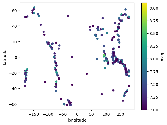
Here is the analogous version using hvplot where we grab the handle high_mag_scatter so we can inspect the return value:
high_mag_scatter = most_severe.hvplot.scatter(x='longitude', y='latitude', c='mag')
high_mag_scatter
As always, this return value is actually a HoloViews element which has a printed representation:
print(high_mag_scatter)
:Scatter [longitude] (latitude,mag)
This representation reveals that even though the scatterplot here looks ok, it’s actually flawed in a subtle way. Earthquakes occur at a particular 2D longitude, latitude location on the earth’s surface and have a measured magnitude, i.e., they are 2D points with some associated value, and should have a representation like “[longitude,latitude] (mag). That is, rather than having two value dimensions, there should be only one value dimension (dependent variable) mag, with the other two being key or index dimensions specifying where that magnitude was measured. The problem here is that the Pandas .scatter call makes no distinction between these types of dimensions, which will confuse HoloViews when it is doing automatic linking and other operations that depend on the interpretation of the data. For this purpose, HoloViews provides a separate .hvplot.points call that has the same visual representation but the correct semantics:
high_mag_points = most_severe.hvplot.points(x='longitude', y='latitude', c='mag')
high_mag_points
print(high_mag_points)
:Points [longitude,latitude] (mag)
This object now appropriately represents that latitude and longitude are the key dimensions, with one value dimension (the magnitude).
We will learn more about HoloViews objects in the next notebook. But first, let’s adjust the options to create a better plot. First we’ll use colorcet to get a colormap that will have a good contrast with blue oceans when we show earthquakes on a map; the default blue colormap above would get lost against the seas! We can choose one from the website and use the HoloViews/Bokeh-based colorcet plotting module to make sure it looks good.
import colorcet as cc
from colorcet.plotting import swatch

mag_cmap = cc.CET_L4[100:]
swatch("CET_L4", mag_cmap)
We’ll also add some additional columns to the hover text, and add a title.
high_mag_points = most_severe.hvplot.points(
    x='longitude', y='latitude', c='mag', hover_cols=['place', 'time'],
    cmap=mag_cmap,  title='Earthquakes with magnitude >= 7', bgcolor="black")

high_mag_points
When you hover over the points you’ll see the place and time of the earthquake in addition to the magnitude and lat/lon. What’s displayed by default corresponds to the dimensions that HoloViews is keeping track of, even though not all have been mapped to visible features of the plot:
print(high_mag_points)
:Points [longitude,latitude] (mag,place,time)
Exercise#
Use the colorcet plotting function swatches(group='linear') to choose a different colormap and create a plot with it.
from colorcet.plotting import swatches
swatches(group='linear')
then
most_severe.hvplot.points(
    x='longitude', y='latitude', c='mag', hover_cols=['place', 'time'],
    cmap="bgy",  title='Earthquakes with magnitude >= 7')
Overlay with a tiled map#
The “CET_L4” colormap works well here, and we can kind of see the outlines of the continents, but the visualization would be much easier to parse if we added a base map underneath showing the actual Earth where the quakes are located. To do this, we’ll import a map tiles element from HoloViews, namely the EsriImagery tiles from ESRI using the Web Mercator projection:
from holoviews.element.tiles import EsriImagery
EsriImagery()
Note that when you zoom, the map becomes more and more detailed, downloading new tiles dynamically as necessary.
In order to overlay on this basemap, we need to project our earthquakes to the Web Mercator projection system used by Bokeh, which can be done by enablling automatic geographic projections using geo=True (which requires GeoViews to be installed).
Instead of using GeoViews (which requries various complex geographic library dependencies), this dataset already includes columns for Web Mercator easting (meters East of Greenwich) and northing (meters north of the equator) columns calculated from longitude and latitude using the HoloViews hv.util.transform.lon_lat_to_easting_northing function. We could add the EsriImagery tiles manually using *, but can also simply add them by invoking tiles='EsriImagery':
most_severe.hvplot.points(
    x='easting', y='northing', c='mag', hover_cols=['place', 'time'],
    cmap=mag_cmap, title='Earthquakes with magnitude >= 7', line_color='black', tiles='EsriImagery')
Note that the Web Mercator projection is only one of many possible projections used when working with geospatial data. If you need to work with these different projections, you can use the GeoViews extension to HoloViews that makes elements aware of the projection they are defined in and automatically projects into whatever coordinates are needed for display.
Exercise#
Import and use different tiles.
(Hint)
Try OSM.
Overlay with a raster#
That base map is helpful for orienting ourselves, but it isn’t really adding much new information. We might instead like to overlay the earthquakes on other data, such as a map of global population, to see how many people might have been affected by each event. We’ll start by reading in a raster of global population using xarray, as multidimensional raster data files are not handled well by Pandas. (Luckily, hvPlot supports xarray just as well as Pandas.)
import xarray as xr
import hvplot.xarray  # noqa: adds hvplot method to xarray objects
ds = xr.open_dataarray(pathlib.Path('../data/raster/gpw_v4_population_density_rev11_2010_2pt5_min.nc'))
ds
<xarray.DataArray (band: 1, y: 4320, x: 8640)> Size: 149MB
[37324800 values with dtype=float32]
Coordinates:
  * band     (band) int64 8B 1
  * y        (y) float64 35kB 89.98 89.94 89.9 89.85 ... -89.9 -89.94 -89.98
  * x        (x) float64 69kB -180.0 -179.9 -179.9 -179.9 ... 179.9 179.9 180.0
Attributes:
    transform:   [ 4.16666667e-02  0.00000000e+00 -1.80000000e+02  0.00000000...
    crs:         EPSG:4326
    res:         [0.04166667 0.04166667]
    is_tiled:    0
nodatavals: -3.4028230607370965e+38cleaned_ds = ds.where(ds.values != ds.nodatavals).sel(band=1)
cleaned_ds.name = 'population'
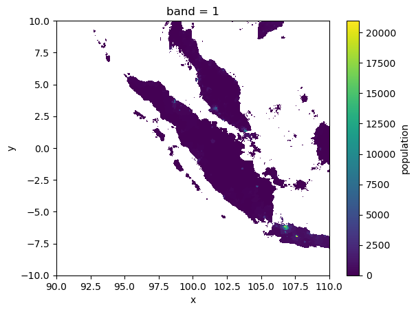
The xarray.plot() Matplotlib API is fine for plotting small sections of this dataset, such as the population of Indonesia:
ROI = cleaned_ds.sel(y=slice(10, -10), x=slice(90, 110))
ROI.plot();
Matplotlib will struggle with the full dataset, but we can use hvPlot+Datashader to see it all and interactively look at patterns with different spatial scales. Here we will apply a logarithmic colormap to the population counts (similar in appearance to eq_hist in this case, but easier for people to interpret), and set a clim to exclude the lower bound of zero from the log calculation:
rasterized_pop = cleaned_ds.hvplot.image(rasterize=True, cnorm='log', clim=(1, np.nan))
rasterized_pop
By inspecting the HoloViews object, we can see that the output isn’t actually a single HoloViews Image; instead it is a DynamicMap of Images, each created on the fly (dynamically) whenever you zoom or pan the plot.
print(rasterized_pop)
:DynamicMap   []
   :Image   [x,y]   (population)
Exercise#
Use .last to inspect the last image from the DynamicMap. Zoom into the plot above and inspect .last again.
Putting it together#
Now let’s overlay the earthquake data on top of the population data, using different colormaps so that we can see both types of data clearly in the same plot.
title = 'High magnitude (>=7) earthquakes over population density [people/km^2] from 2000 to 2019'

pop = cleaned_ds.hvplot.image(
    rasterize=True, cmap='kbc', logz=True, clim=(1, np.nan),
    height=600, width=1000, xaxis=None, yaxis=None, title=title
)
high_mag_points = most_severe.hvplot.points(
    x='longitude', y='latitude', c='mag',
    hover_cols=['place', 'time'], cmap=mag_cmap).opts(bgcolor='black') # .opts is described in the next notebook

pop_and_high_mag = (pop * high_mag_points)
pop_and_high_mag
Once again we have used the * operator, this time to build an overlay of our earthquake points on top of the population raster.
print(pop_and_high_mag)
:DynamicMap   []
   :Overlay
      .Image.I  :Image   [x,y]   (population)
      .Points.I :Points   [longitude,latitude]   (mag,place,time)
As you can see, the HoloViews objects returned by hvPlot are in no way dead ends – you can flexibly compare, combine, lay out, and overlay them to reveal complex interrelationships in your data. In fact, this idea of avoiding dead ends is one of the major design principles for HoloViz tools:
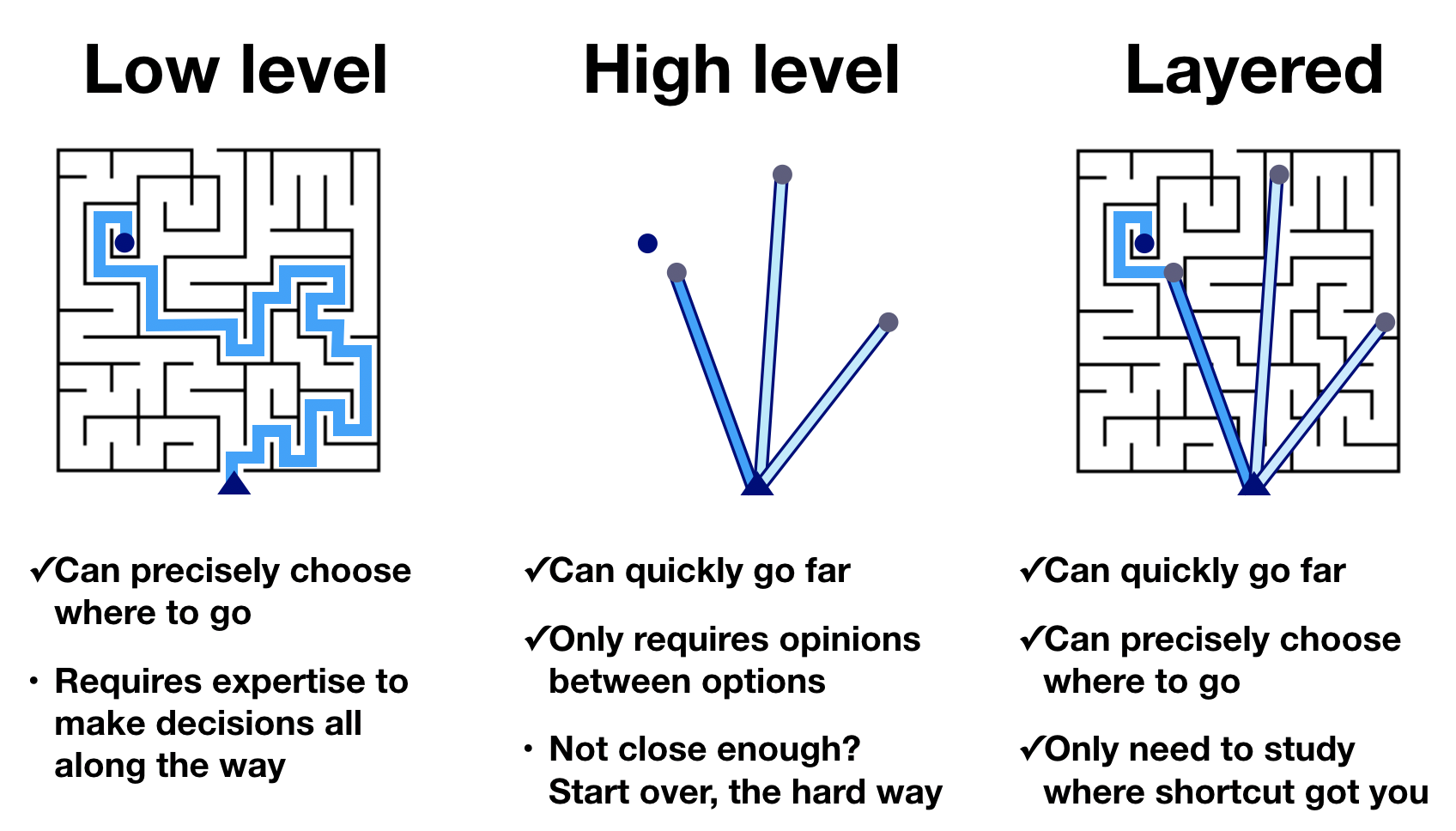
That is, instead of forcing you to choose between a powerful low-level tool that requires extensive expertise even to get started, or a high-level tool that’s eventually a dead end, HoloViz tools try to provide you a quick way to get to something that is at least nearly what you want, while making it possible to further customize and tweak what you get so that the end result can be precisely what you want. That way you only need to learn the specific low-level bits actually required, whether that’s at the HoloViews level (if you need to customize your hvPlot-generated objects), or further down to Bokeh and JavaScript when required.
In the next notebook we’ll learn how to link up the HoloViews plots you’ve generated, to help you understand the relationships between the various views of your data that you create.
