HoloViz Talk#
Revealing your data (nearly) effortlessly,
at every step in your workflow
Workflow from data to decision#
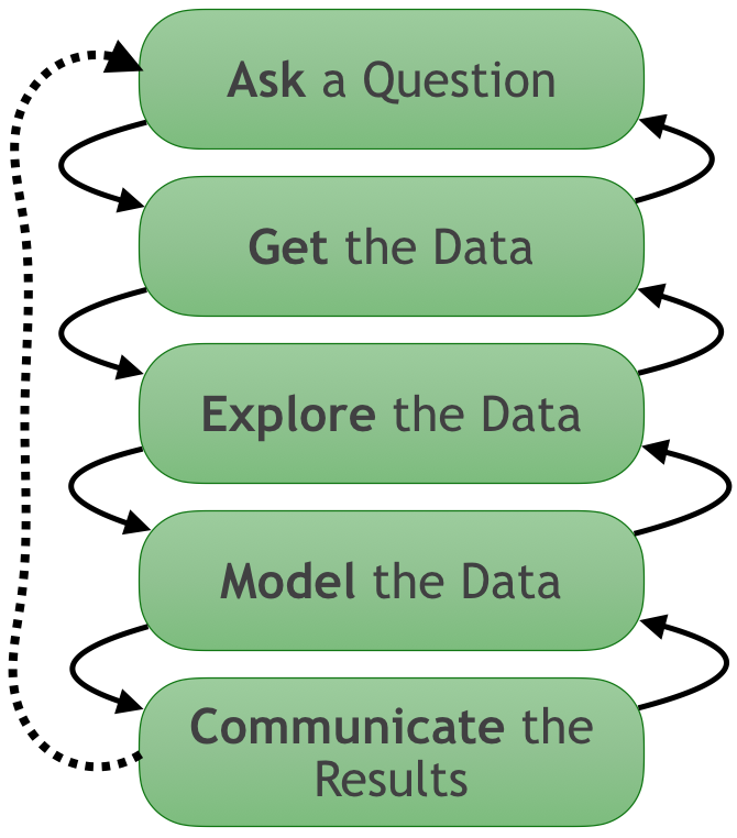
If there's no visualization at any of these stages, you're flying blind.
But visualization is often skipped as too hard to construct, particularly for big data.
What if it were simple to visualize anything, anywhere?
Good news/
Bad news
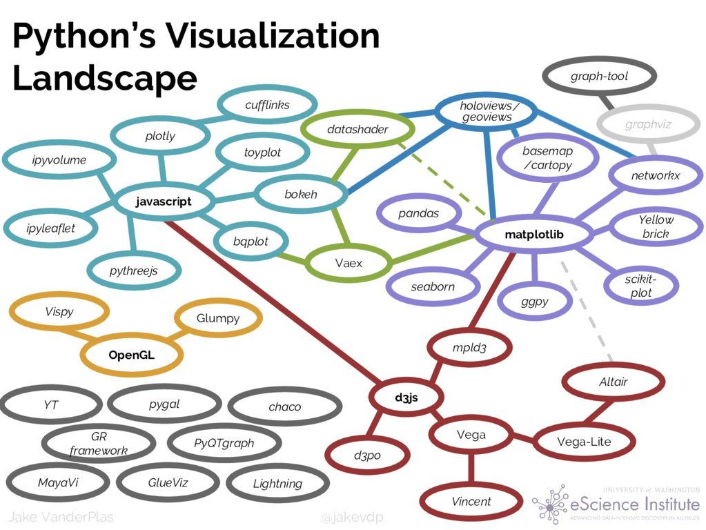
Lots of choices!
Too hard to
try them all,
learn them all, or
get them to work together.

HoloViz:
Seamless interoperability
for browser-based
viz tools
Supported by Anaconda, Inc.
HoloViz Goals:#
Full functionality in browsers (not desktop)
Full interactivity (inside and out of plots)
Focus on Python users, not web programmers
Start with data, not coding
Work with data of any size
Exploit general-purpose SciPy/PyData tools
Focus on 2D primarily, with some 3D
Avoid entangling your data, code, and viz:
Same viz/analysis code in Jupyter, Python, HPC, …
Widgets/apps in Jupyter, standalone servers, web pages
Jupyter as a tool, not part of the results
Exploring Pandas Dataframes#
If your data is in a Pandas dataframe, it’s natural to explore it using the .plot() method (based on Matplotlib). Let’s look at a dataset of the number of cases of measles and pertussis (per 100,000 people) over time in each state:
from pathlib import Path
import pandas as pd
df = pd.read_csv(Path('../data/diseases.csv.gz'))
df.head()
| Year | Week | State | measles | pertussis | |
|---|---|---|---|---|---|
| 0 | 1928 | 1 | Alabama | 3.67 | NaN |
| 1 | 1928 | 2 | Alabama | 6.25 | NaN |
| 2 | 1928 | 3 | Alabama | 7.95 | NaN |
| 3 | 1928 | 4 | Alabama | 12.58 | NaN |
| 4 | 1928 | 5 | Alabama | 8.03 | NaN |
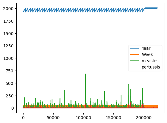
Just calling .plot() won’t give anything meaningful, because it doesn’t know what should be plotted against what:
%matplotlib inline
df.plot();
But with some Pandas operations we can pull out parts of the data that make sense to plot:
import numpy as np
by_year = df[["Year","measles"]].groupby("Year").aggregate(np.sum)
by_year.plot();
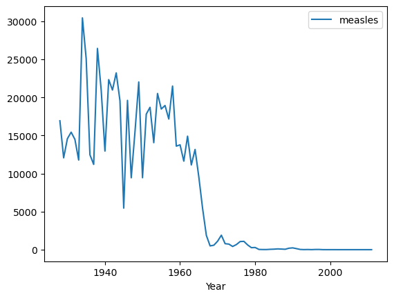
Here it is easy to see that the 1963 introduction of a measles vaccine brought the cases down to negligible levels.
Exploring Data with hvPlot and Bokeh#
The above plots are just static images, but if you import the hvplot package, you can use the same plotting API to get fully interactive plots with hover, pan, and zoom in a web browser:
import hvplot.pandas # noqa: adds hvplot method to pandas objects
by_year.hvplot()
# Optional; load Matplotlib support (defaults to Bokeh)
hvplot.extension('bokeh', 'matplotlib', width="100")
Here the interactive features are provided by the Bokeh JavaScript-based plotting library. But what’s actually returned by this call is something called a HoloViews object, here specifically a HoloViews Curve. HoloViews objects display as a Bokeh plot, but they are actually much richer objects that make it easy to capture your understanding as you explore the data:
import holoviews as hv
vline = hv.VLine(1963).opts(color='black')
m = by_year.hvplot() * vline * \
hv.Text(1963, 27000, " Vaccine introduced", halign='left')
m
while still always being able to access the original data involved for further analysis:
print(m)
m.Curve.I.data.head()
:Overlay
.Curve.I :Curve [Year] (measles)
.VLine.I :VLine [x,y]
.Text.I :Text [x,y]
| measles | |
|---|---|
| Year | |
| 1928 | 16924.34 |
| 1929 | 12060.96 |
| 1930 | 14575.11 |
| 1931 | 15427.67 |
| 1932 | 14481.11 |
For other plotting libraries, a given visualization that you construct is a dead end – if you want to change it in some way, you’ll need to reconstruct it from scratch with different settings.
Because HoloViews objects preserve your original data, you can now do more with your data than you could before, including anything you could do with the raw data, plus overlaying (as above), laying out in subfigures, slicing, sampling, setting options, and many other operations.
For instance, with HoloViews it’s simple to break down the data in different ways. You can inspect each state individually:
measles_agg = df.groupby(['Year', 'State'])['measles'].sum()
by_state = measles_agg.hvplot('Year', groupby='State', width=500, dynamic=False)
by_state * vline
Or pull out a couple of those to put side by side:
by_state["Texas"].relabel('Texas') + by_state["New York"].relabel('New York')
Or to compare four states over time by overlaying:
states = ['New York', 'New Jersey', 'California', 'Texas']
measles_agg.loc[1930:2005, states].hvplot(by='State') * vline
Or by faceting:
measles_agg.loc[1930:2005, states].hvplot('Year', col='State', width=200, height=150, rot=90) * vline
Or as a different type of plot, such as a bar chart:
measles_agg.loc[1980:1990, states].hvplot.bar('Year', by='State', rot=90)
Or with additional information, such as error bars:
df_error = df.groupby('Year').agg({'measles': [np.mean, np.std]}).xs('measles', axis=1)
df_error.hvplot(y='mean') * hv.ErrorBars(df_error, 'Year').redim.range(mean=(0, None)) * vline
If we really want to invest a lot of time in making a fancy plot, we can customize it to try to show all the yearly data about measles at once:
def nansum(a, **kwargs):
return np.nan if np.isnan(a).all() else np.nansum(a, **kwargs)
heatmap = df.hvplot.heatmap('Year', 'State', 'measles', reduce_function=nansum,
logz=True, height=500, width=900, xaxis=None, flip_yaxis=True, clim=(1, np.nan))
aggregate = hv.Dataset(heatmap).aggregate('Year', np.mean, np.std)
agg = hv.ErrorBars(aggregate) * hv.Curve(aggregate).opts(xrotation=90)
agg = agg.options(height=200, show_title=False)
marker = hv.Text(1963, 800, u'\u2193 Vaccine introduced', halign='left')
(heatmap + (agg * marker).opts(width=900)).cols(1)
If you prefer, you can choose Matplotlib to render your HoloViews plots, though you give up the interactive pan, zoom, and hover from Bokeh:
mpl = by_state * hv.VLine(1963).opts(color="black") * \
hv.Text(1963, 1000, " Vaccine introduced", halign='left')
hv.output(mpl, backend='matplotlib')
As you can see, these tools make it very quick to explore your data in a browser, and if you choose HoloViews+Bokeh plots, you can have full interactivity with very little code even for quite complex datasets.
Interactive statistical plots#
For high-dimensional datasets with additional data variables, we can compose all the above faceting methods as needed.
For instance, let’s look at the Iris dataset:
from bokeh.sampledata.iris import flowers as iris
iris.tail()
| sepal_length | sepal_width | petal_length | petal_width | species | |
|---|---|---|---|---|---|
| 145 | 6.7 | 3.0 | 5.2 | 2.3 | virginica |
| 146 | 6.3 | 2.5 | 5.0 | 1.9 | virginica |
| 147 | 6.5 | 3.0 | 5.2 | 2.0 | virginica |
| 148 | 6.2 | 3.4 | 5.4 | 2.3 | virginica |
| 149 | 5.9 | 3.0 | 5.1 | 1.8 | virginica |
We can now look at all these relationships at once, interactively (being sure to try out the lasso tool to show how subsets of the data relate across plots):
hvplot.scatter_matrix(iris, c='species')
Branching out: large data, geo data, custom controls#
HoloViz is a modular suite of tools, and when you need capabilities not handled by Bokeh and HoloViews (and optionally hvPlot) as above, you can bring those in:
GeoViews: Visualizable geographic HoloViews objects
Datashader: Rasterizing huge HoloViews objects to images quickly
Param: Declarative parameters
Panel: Making it simple to work with widgets inside and outside of a notebook context
Colorcet: perceptually uniform colormaps for big data
We’ll look at a large(ish) dataset of 2 million earthquakes on a map, with the following caveat:
import dask.dataframe as dd
from colorcet import palette
from holoviews.element.tiles import EsriImagery
topts = hv.opts.Tiles(width=700, height=600, bgcolor='black',
xaxis=None, yaxis=None, show_grid=False)
tiles = EsriImagery().opts(topts)
earthquakes = dd.read_parquet(Path('../data/earthquakes-projected.parq'), engine='pyarrow').persist()
colormaps = {n: palette[n] for n in ['fire','bgy','bgyw','bmy','gray','kbc']}
NOTE: If you didn’t use conda to install holoviz, you might get an error message about missing SNAPPY. You can get all the dependencies by installing python-snappy using conda: conda install python-snappy or follow these steps.
import hvplot.dask # noqa: adds hvplot method to dask objects
def view(cmap=colormaps['fire'], alpha=1, reverse_colormap=False):
cmap = cmap if not reverse_colormap else cmap[::-1]
pts = earthquakes.hvplot.points('easting', 'northing',
rasterize=True, cmap=cmap, cnorm='eq_hist', dynspread=True)
return tiles.opts(alpha=alpha) * pts
view()
As you can see, you can specify geo plots easily and if your HoloViews objects are too big to visualize in a browser directly, you can add datashade=True or rasterize=True to render them into images dynamically on zooming, etc.
NOTE: HoloViews includes support for basic web-based map tiles as used here, but if you need to work flexibly with different geographic projections, you’ll want to install GeoViews as well. See the notebook on Geographic Data for more information.
You can also easily add widgets to control filtering, selection, and other options interactively, either here in the notebook or by putting the same code in a separate file and running it as a standalone server:
import panel as pn
explorer = pn.interact(view, cmap=colormaps, alpha=(0, 1.), reverse_colormap=False)
pn.Row(pn.Column('# Earthquake Explorer', explorer[0]), explorer[1]).servable()
Here we used the Panel interact function to create a simple app based on the view function, and then we mixed and matched some of its components to lay it out in rows and columns as you see above.
In this simple app, the view function is called whenever any of the parameters change (alpha, colormap, or location), triggering a full rerender, but you can get a more responsive interface if you take the time to declare which computations depend on which parameters (see the Panel docs).
Either way, the app should work the same here in the notebook (if you have a live Python process) or as a standalone server by calling panel serve with either the name of a Python file with the above code or simply the name of this notebook (where it will run the notebook code and serve any objects marked .servable()).)
As you can see, the HoloViz tools let you integrate visualization into everything you do, using a small amount of code that reveals your data’s properties and captures your understanding of it. The rest of these tutorials will break down each of the topics covered above, showing you step by step how to work with your own data using these tools.
Thanks to all of the HoloViz contributors!
